Product Design · AI Operations · Breezeway
AI Operations Dashboard
Designing the one screen where property managers can see everything the AI did — and decide everything it shouldn't do alone.
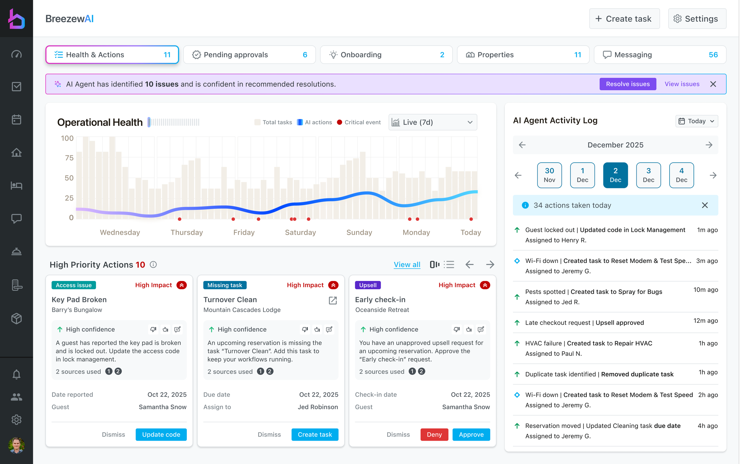
Health & Actions — the default view. Operational health on the left, a live record of everything the AI touched on the right.
The Problem
The AI got faster. Oversight didn't.
Breezeway had been shipping AI in pieces — an assistant drafting guest replies, a concierge fielding questions inside Guide, automation quietly generating tasks off reservation changes. Each one worked. Each one lived on its own screen.
For a property manager running 27 homes, that meant the AI's work was real but unaccounted for. A task got created overnight and nobody knew why. An upsell request sat unapproved for two days because it lived in a queue no one opened. A guest asked about check-out and the AI came up empty — a knowledge gap that vanished the moment the conversation ended.
The complaint we kept hearing wasn't "the AI is wrong." It was "I don't know what it's doing." Managers were being asked to delegate to a system they couldn't audit, and the rational response to that is to turn it off.
The brief: build one surface that makes AI activity legible, puts every decision that needs a human in front of a human, and turns each of the AI's misses into something the system learns from.
Automation doesn't lose trust by being wrong. It loses trust by being invisible.
The System
Five surfaces, one spine
The dashboard is organized around what the manager has to do, not around which AI feature produced the work. Five tabs — Health & Actions, Pending Approvals, Onboarding, Properties, Messaging — each carrying a live count, so the nav doubles as a workload read before you click anything.
Underneath all five sits the same routing logic. Every signal the AI processes gets scored for confidence, and that score decides the interaction: act and log it, recommend it with a one-tap control, or stop and ask. The activity log is the spine — every branch writes to it, so there is always one honest answer to "what did it do?"
AI Operations Dashboard — how work reaches the manager
Signals in
↓
↓
Surfaced across
↓
Principle 01
Show the reasoning, not just the recommendation
Every action card carries a confidence rating, a plain-language explanation, and a count of the sources behind it — a guest message, a lock record, a reservation. "Key pad broken at Barry's Bungalow, guest reported Oct 22, update the access code" is a claim a manager can check in three seconds, which is the whole point.
The banner at the top offers to resolve all ten high-confidence issues at once. That offer is only credible because each card underneath can be inspected individually — bulk action is earned by transparency, not substituted for it. Thumbs up, thumbs down, and edit sit on every card, so correcting the AI is as fast as accepting it.
Confidence, explanation, and sources on every card — plus the two controls that matter: resolve, or dismiss.
Principle 02
Decisions with money attached always stop for a human
Upsell requests and task payments never auto-execute, no matter how confident the model is. Confidence governs how much work the AI does to prepare a decision; it never governs whether a revenue decision gets made without you.
So the approvals queue is designed for speed instead of autonomy. Requests are grouped by type, each card is scannable at a glance, and there are three exits — Approve, Deny, Skip. Skip matters more than it looks: without it, managers avoid the queue entirely rather than commit to a decision they aren't ready to make.
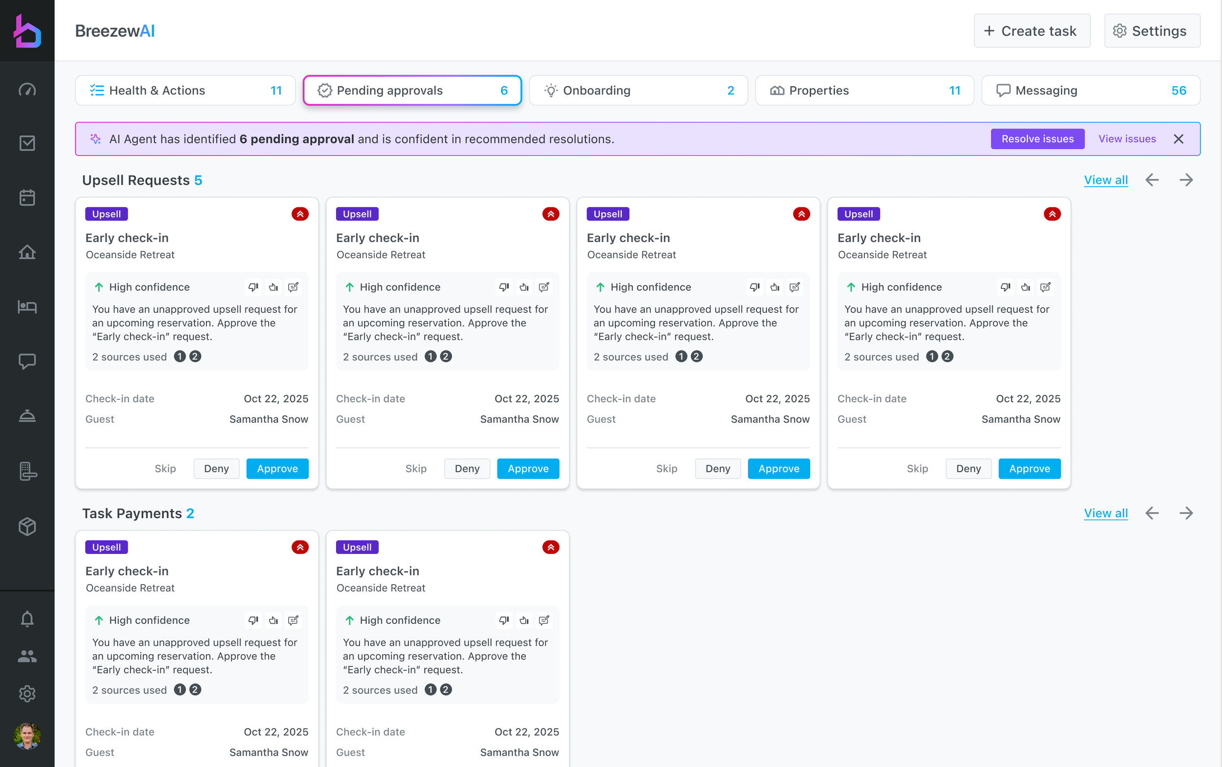
Pending Approvals — grouped by type, three exits per card. Skip is a first-class option.
Principle 03
A miss is the most valuable thing the AI produces
When a guest asks what they need to do before check-out and the AI can't find an answer, most systems log an error. This one opens a topic: the property, the date, the conversation that exposed the gap, and a single button — Add to knowledge base.
Naming the tab Onboarding rather than Errors was a deliberate reframe. Managers don't have an hour to configure an AI up front, and they'll never guess which content is missing in the abstract. Real guest questions tell them, and each one answered permanently expands what the AI can handle alone. Low confidence is displayed honestly — red arrow, "AI could not find any information" — because a system that admits ignorance is one you can eventually trust with more.
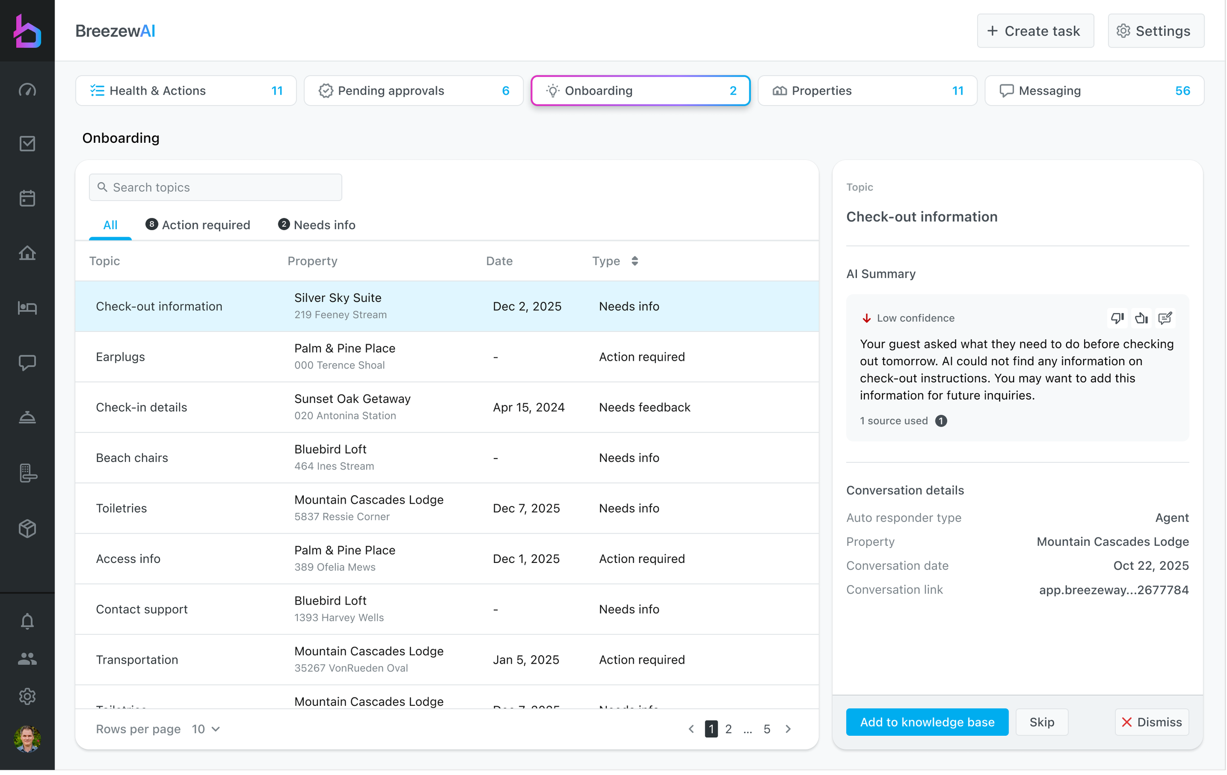
Onboarding — every gap the AI hits becomes a specific, answerable question tied to the conversation that raised it.
Principle 04
Let the AI do the fetching. Keep the judgment human.
Property content is where automation is most tempting and most dangerous. The AI pulls photos in from the connected PMS, matches them to the right home, and stages them — the tedious part, done. But it stops before publishing, because which photo represents a property is a taste decision with a real cost when it's wrong.
The list carries per-property action counts so a manager can work down 27 homes by priority instead of hunting. The split is the pattern: the AI gathers, the human approves. That division of labor removes almost all of the work while keeping every bit of the control.
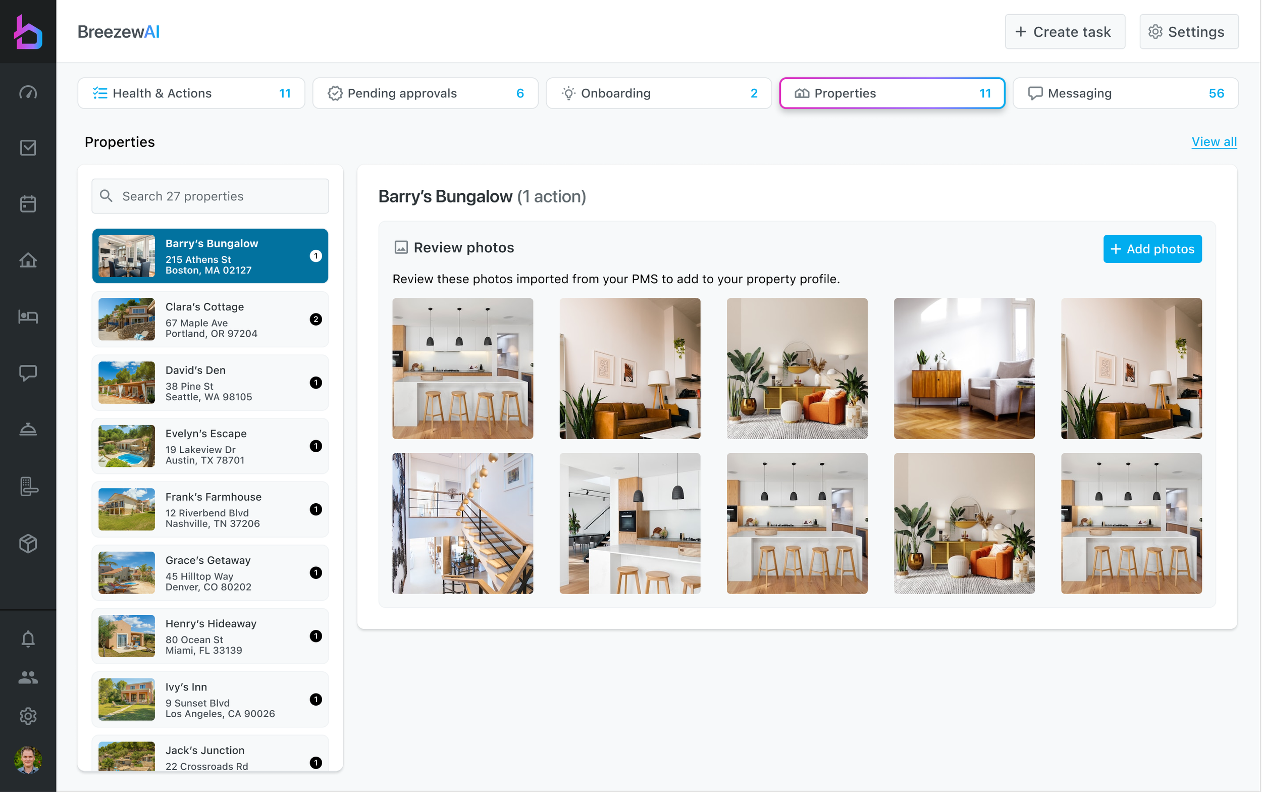
Properties — imported, matched, and staged by the AI. Published by a person.
Principle 05
Autonomy is a dial, and it's visible on every row
The messaging queue shows conversations that need attention, each with the guest's detected sentiment, the action the AI proposes, and a badge reading AI CO-PILOT ON or PAUSED — set per conversation, not per account.
This is the piece I'd defend hardest. Trust in automation isn't a global setting; it's situational. A manager will happily let the AI run a wi-fi complaint and want to handle an unhappy guest personally, and that judgment can change mid-stay. Making the state visible on the row — and reversible from the row — meant nobody had to choose between full automation and none. Sentiment tabs let them go straight to the conversations where a human voice actually changes the outcome.
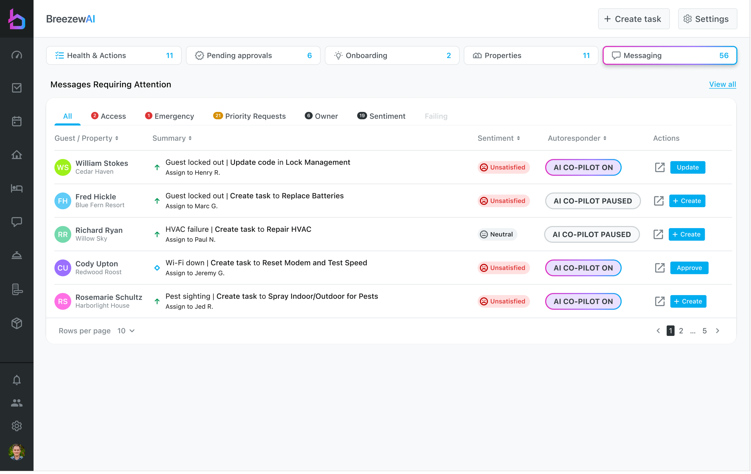
Messaging — co-pilot state is per conversation, visible on the row, reversible in one tap.
Measurement
Trust is a metric, so we measure it
The thumbs up, thumbs down, and edit controls on every card aren't decoration — they're the instrumentation. Paired with approve/deny/skip rates and the confidence score attached to each recommendation, they let us tell the difference between an AI that's accurate and an AI that's trusted, which are not the same thing and don't move together.
Reflection
Designing the brakes, not the engine
The engineering challenge on this project was making the AI capable. The design challenge was the opposite — deciding where it should stop, and making those stops feel like control rather than friction.
Almost every meaningful decision here was a restraint. Revenue always stops for a human. Photos are staged but never published. Autonomy is per conversation, not per account. Low confidence is stated plainly instead of smoothed over. None of it makes the demo more impressive, and all of it is why a manager keeps the feature switched on in month three.
The dashboard's real job isn't showing what AI can do. It's giving someone responsible for 27 homes and a few hundred guests a place to stand.