
THE MUSEUM OF JURASSIC TECHNOLOGY | UX CASE STUDY
2-WEEK CASE STUDY | WEBSITE REDESIGN
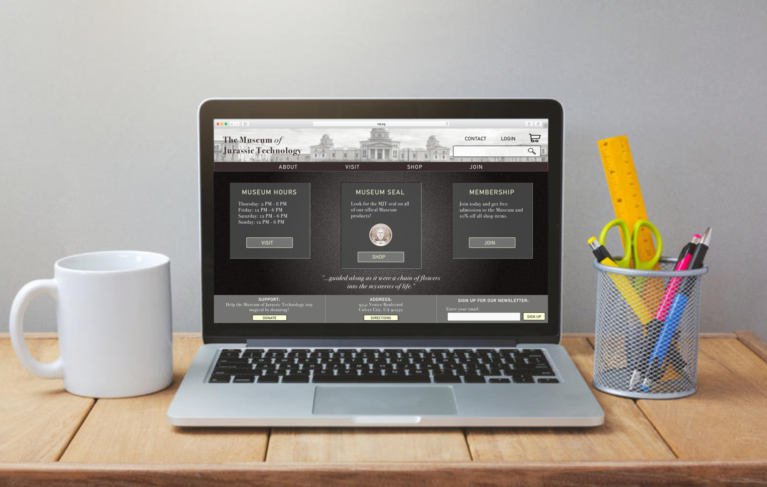
PROBLEM...
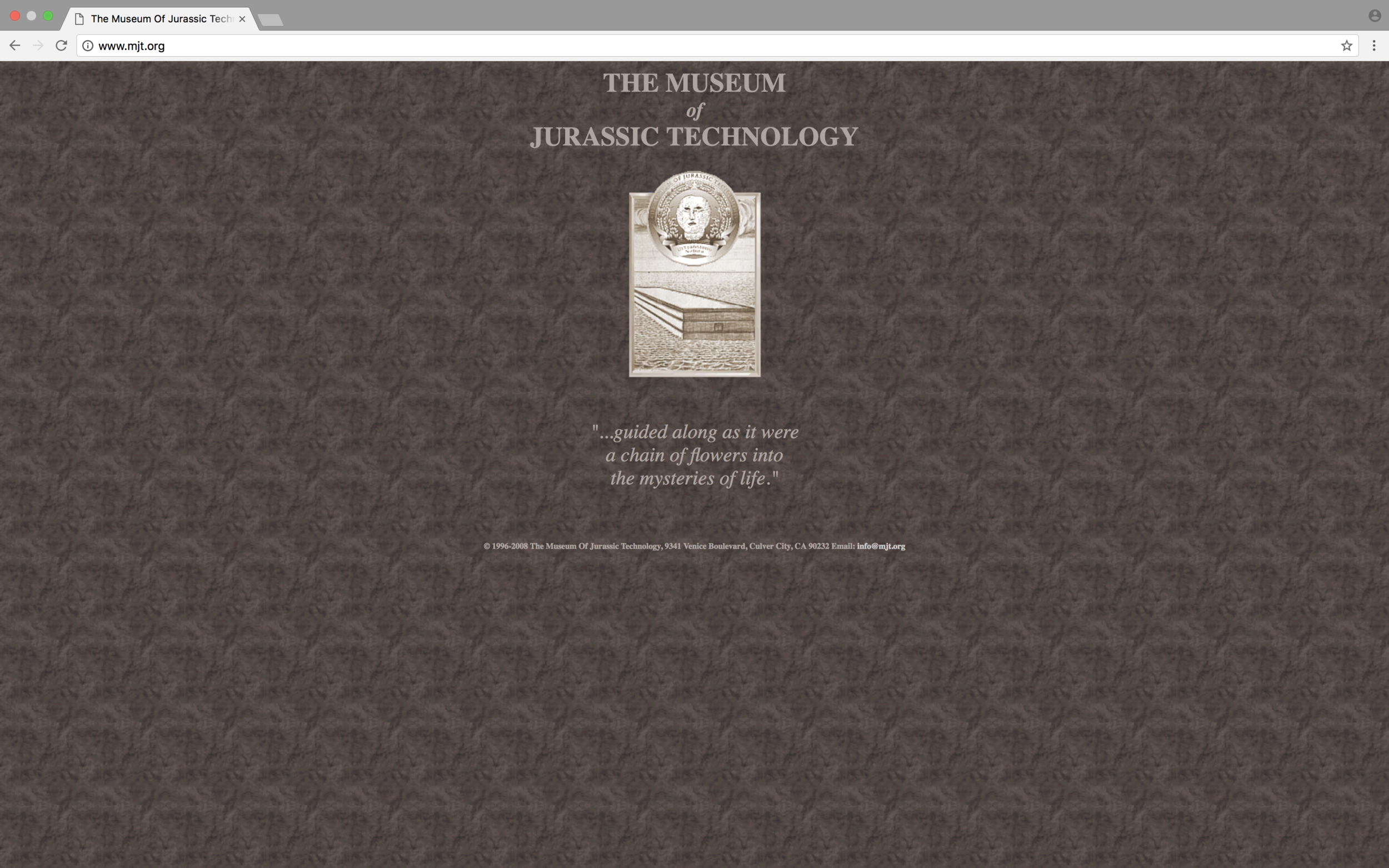
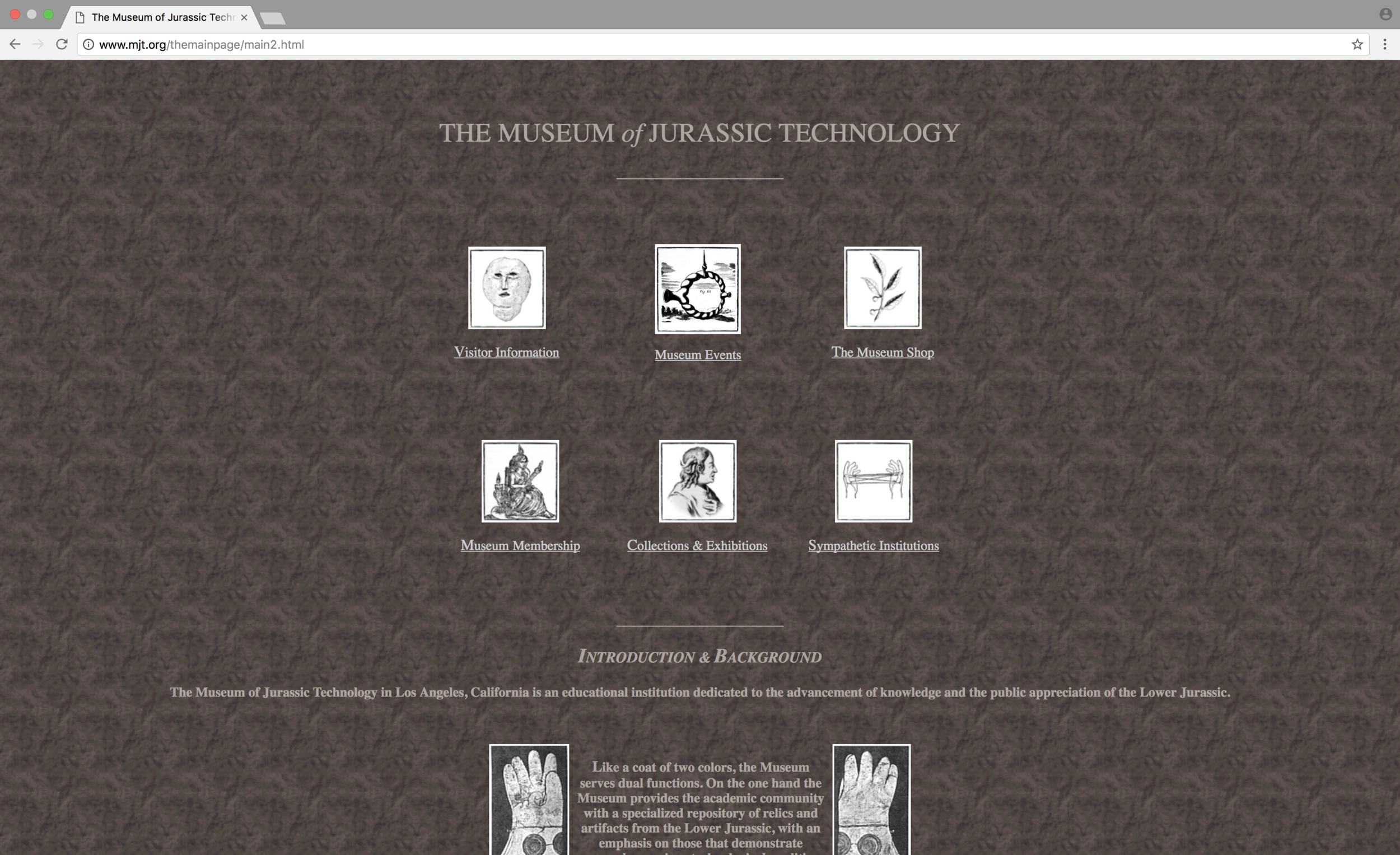
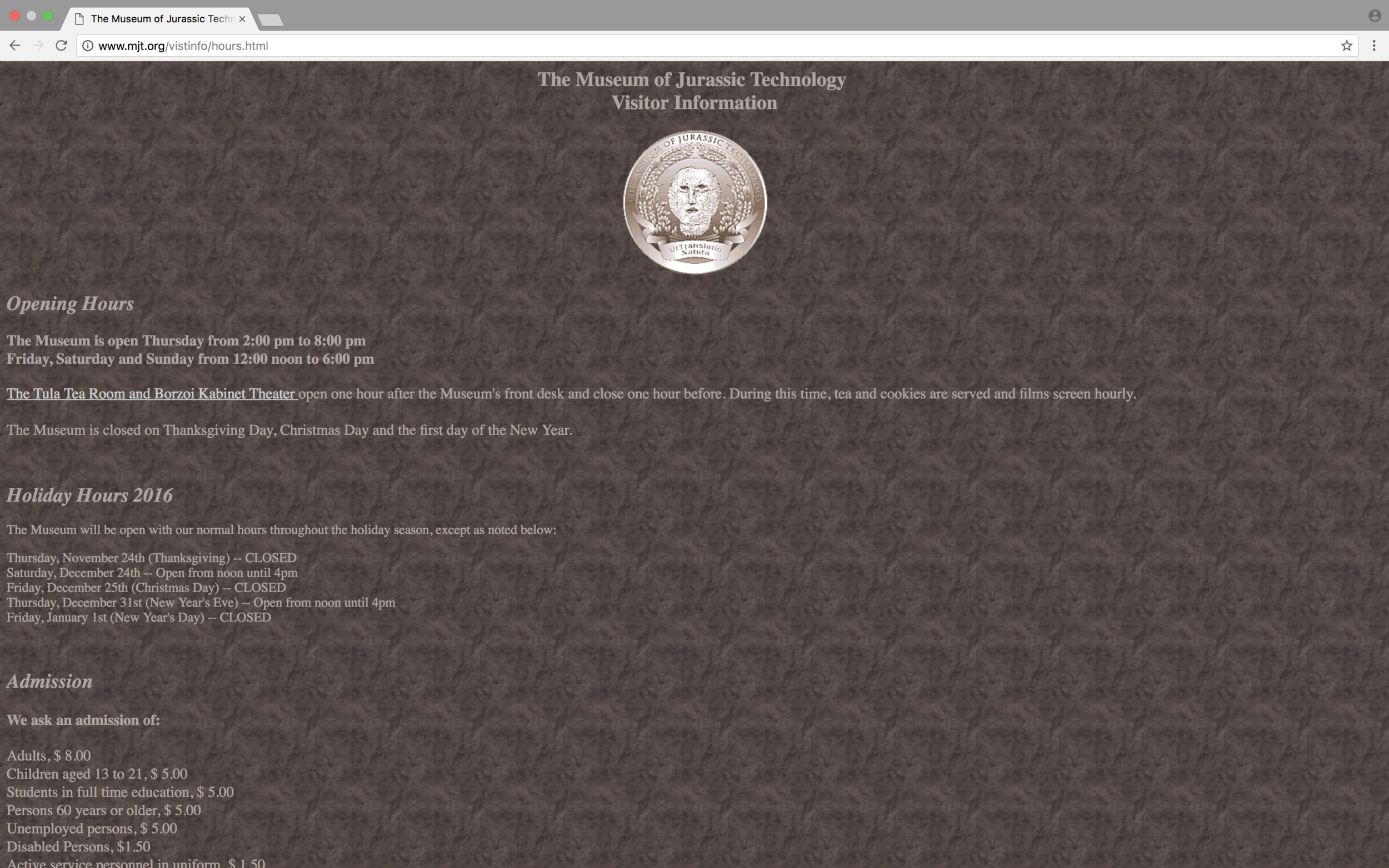
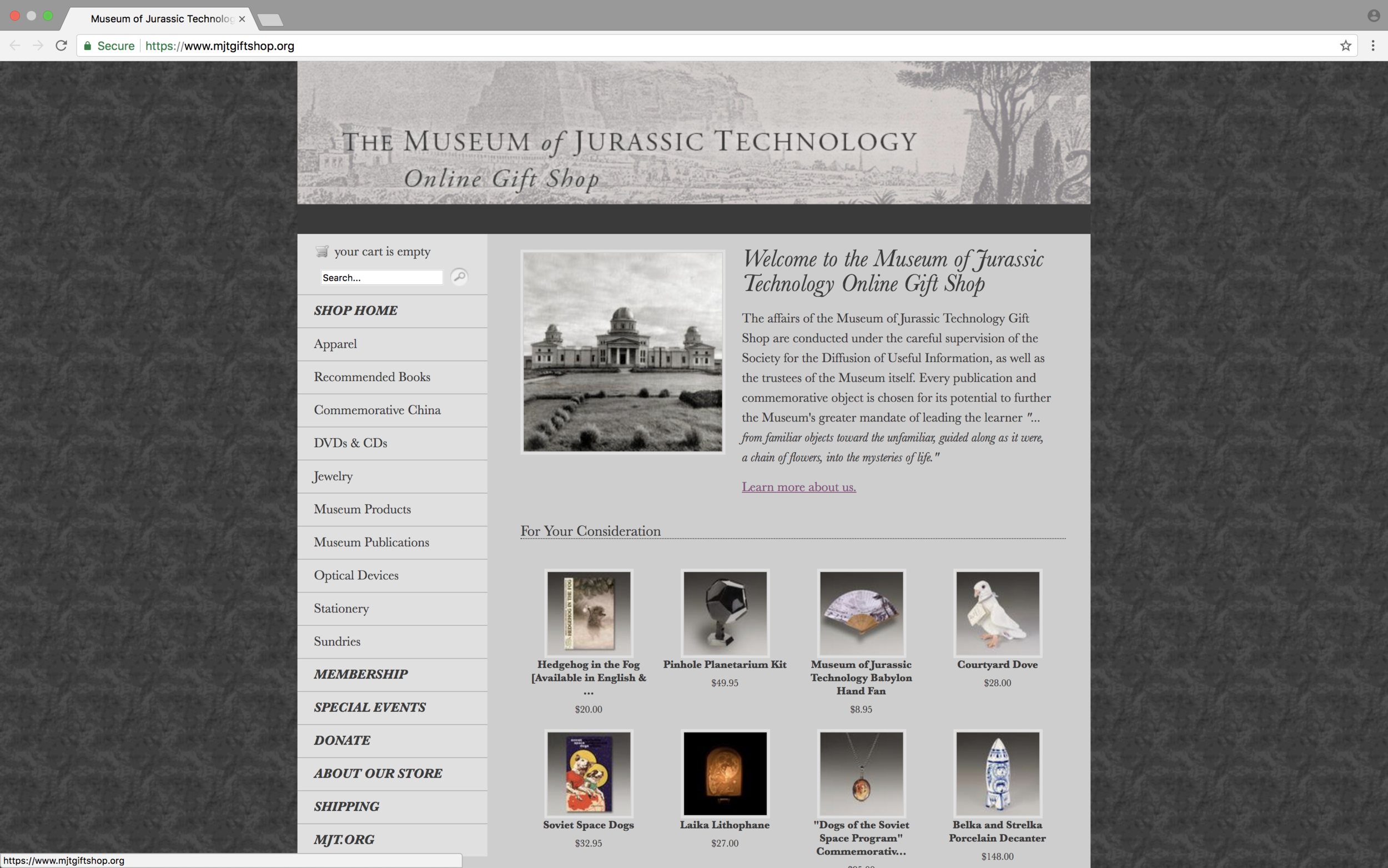
The Museum of Jurassic Technology offers an extremely unique and mysterious museum experience. However, the website is extremely difficult to navigate and aesthetically unpleasing.
THE GOAL..
To implement a consistent navigation layout throughout MJT's website, allowing for seamless and intuitive user flow.
MY ROLE...
As the sole UX/ UI designer on this project I was tasked with planning research strategies, conducting user research, and synthesizing my research findings. I then implemented my findings into a new, easy to navigate design for the Museum of Jurassic Technology's website.
- Identify potential problems
- Identify assumptions
- User interviews
- User Observation
- Contextual Analysis
- Competetive & Comparative Analysis
- Validate assumptions
- Analyze findings
- Create personas
- Workshop findings
- Client research briefing
- Brainstorming
- Sketching
- Low/ medium fidelity wireframes
- Information Architecture
- User flows
- User jounrey
- User testing
- High fidelity wireframes
- Prototype
User Research
During this two week project I practiced a few different methods of user research. The most insightful methods in this case study were user interviews, task analysis, feature prioritization, and online reviews. I found that I got the best feedback when I observed users going through the website(task analysis), and had follow up questions prepared. I was also able to interview a few MJT visitors when I visited the museum myself.
By conducting user research in this manner, I was able to witness issues with the site in real time, through the eyes of the actual users. My follow up interview questions allowed me to dig deeper into why the users were having trouble with the site and what improvements could be made. Visiting the museum, reading online reviews, and listening to the founder, David Wilson, give a speech, gave me a great sense of the museums brand.
PERSONA

WAYNE ANDERSON
- Wayne is a 31 year old high school history teacher who was born and raised in LA.
- He loves museums and visits one or two a month.
- He brings his class on field trips to museums once a month.
- He always gets a souvenir from each museum to keep in his class.
- He gets easily frustrated when things are unorganized and overly complicated for no reason.
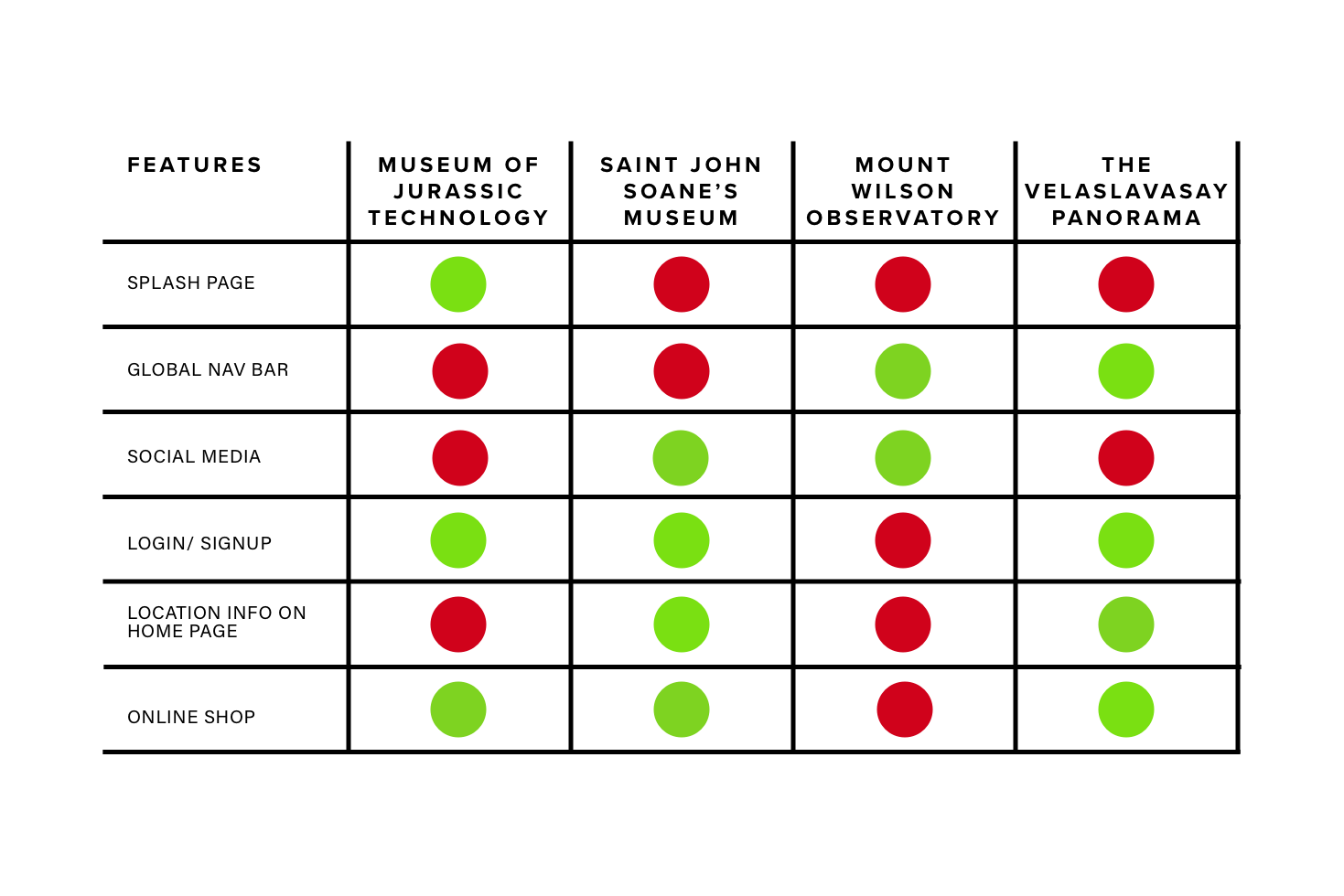
Competitive & Comparative Analysis
Current Site
Information Architecture
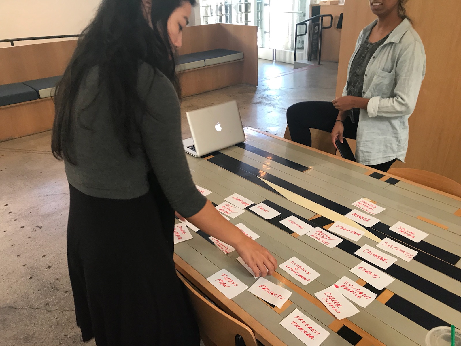
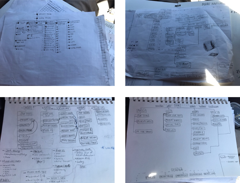
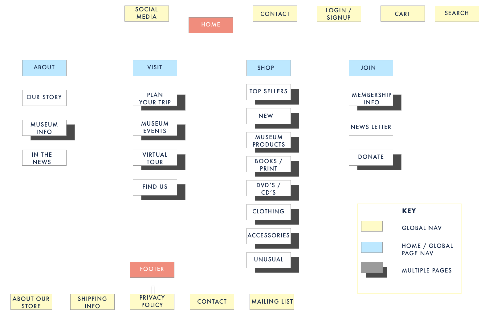
In order to create a new site map for MJT (left) I conducted various card sorts (above). A card sort is when you have a user organize features in the way they think makes the most sense. We can learn a lot of from card sorting and it is a great way to prioritize features and validate your information architecture.
My new site map for MJT shows a much simpler and cleaner layout. Based on my findings, I was able to conclude that users needed four features in their main navigation instead of six. Many of the pages could be combined into one, making the site less crowded. The simplified site map will lead to a more seamless and intuitive user flow.
Low / Medium-Fidelity Wire Frames
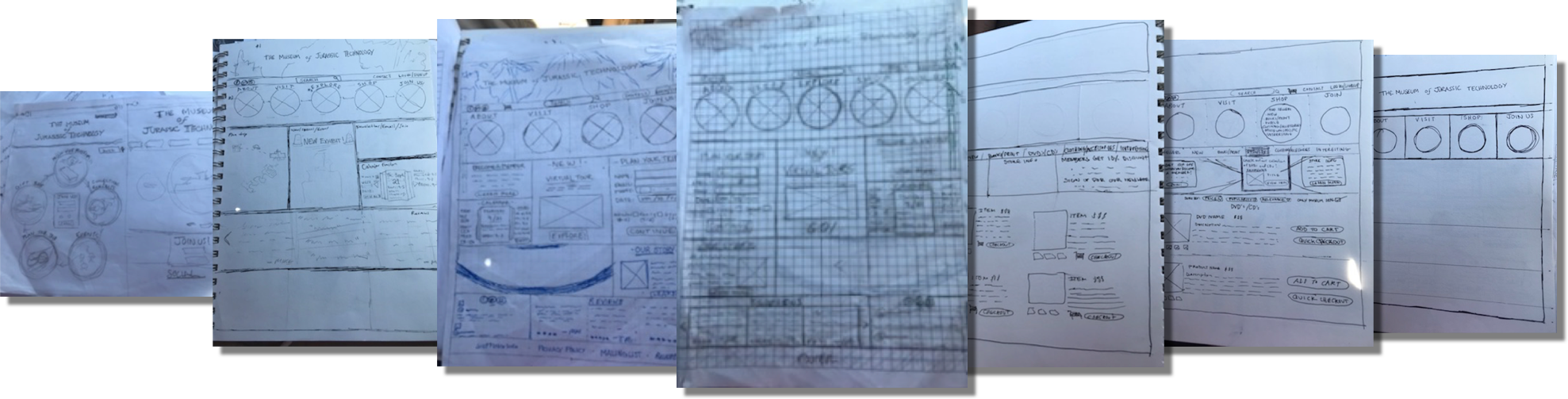
Pictured above are my low-fidelity wireframe sketches. I like to start the process of sketching by simply putting my pen to the paper and seeing what comes out. I usually have a few different ideas in mind for how I would like my design to look and I keep my first sketches intrinsic. After a few quick sketches, either on a whiteboard or paper, I begin to do task analysis. Task analysis is when I observe a user attempting to complete a user flow and see where they get hung up. After analyzing my findings I begin to go into more detailed sketches, using a ruler and pen. I then conduct another round of user tests. After I am satisfied with my sketches I move onto medium-fidelity wire frames.
My medium-fidelity wireframes (above) were done in Sketch and are a digitized version of my low-fidelity sketches. Medium-fidelity wireframes are subject to more user testing and changes; however, they are usually a solid outline for the high-fidelity wireframes. With these wireframes I was looking to find find a happy medium between unique (with the circular navigation bars) and a more traditional scheme in the websites body. After more user testing it is on to high-fidelity wireframes.
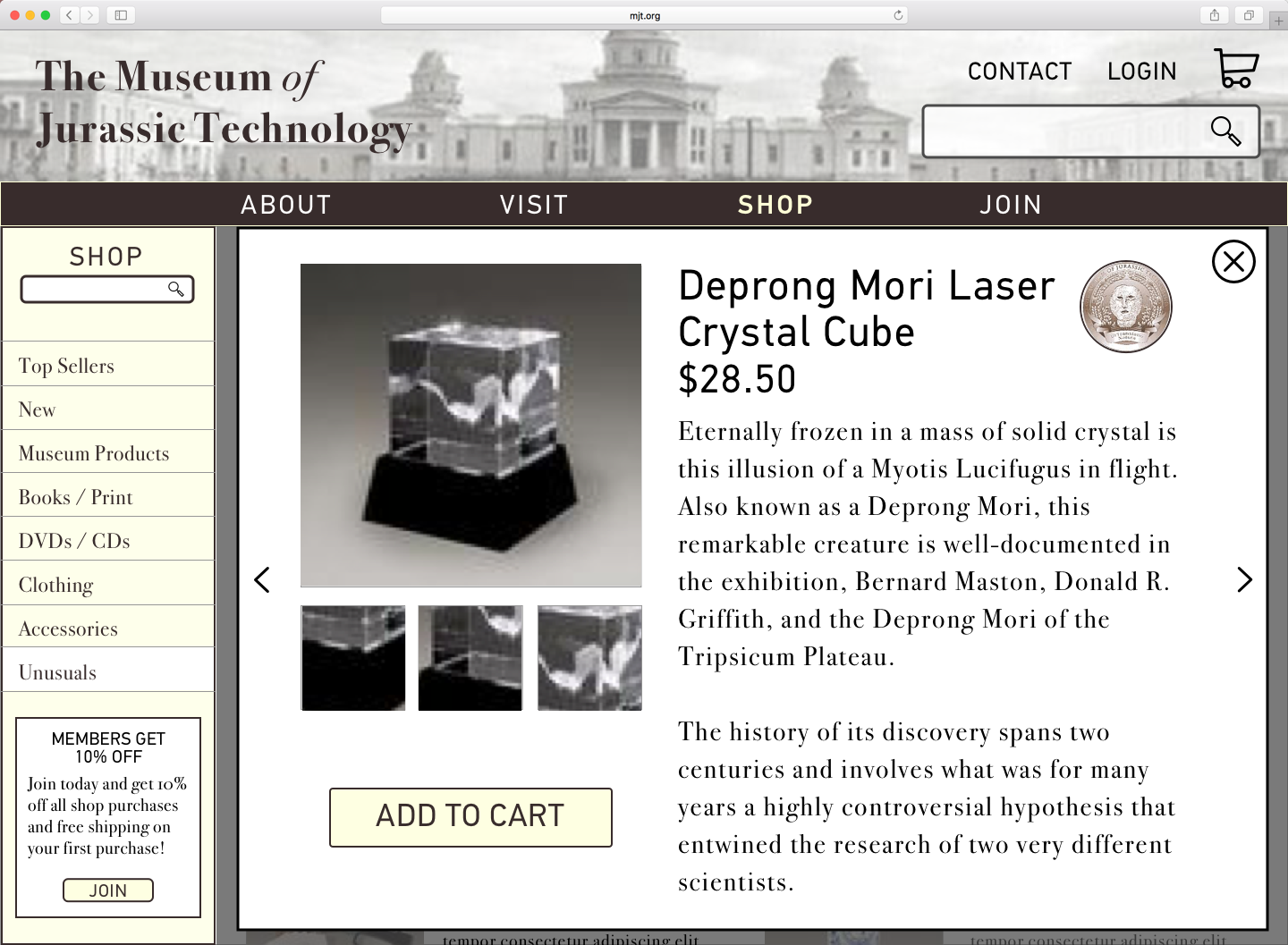
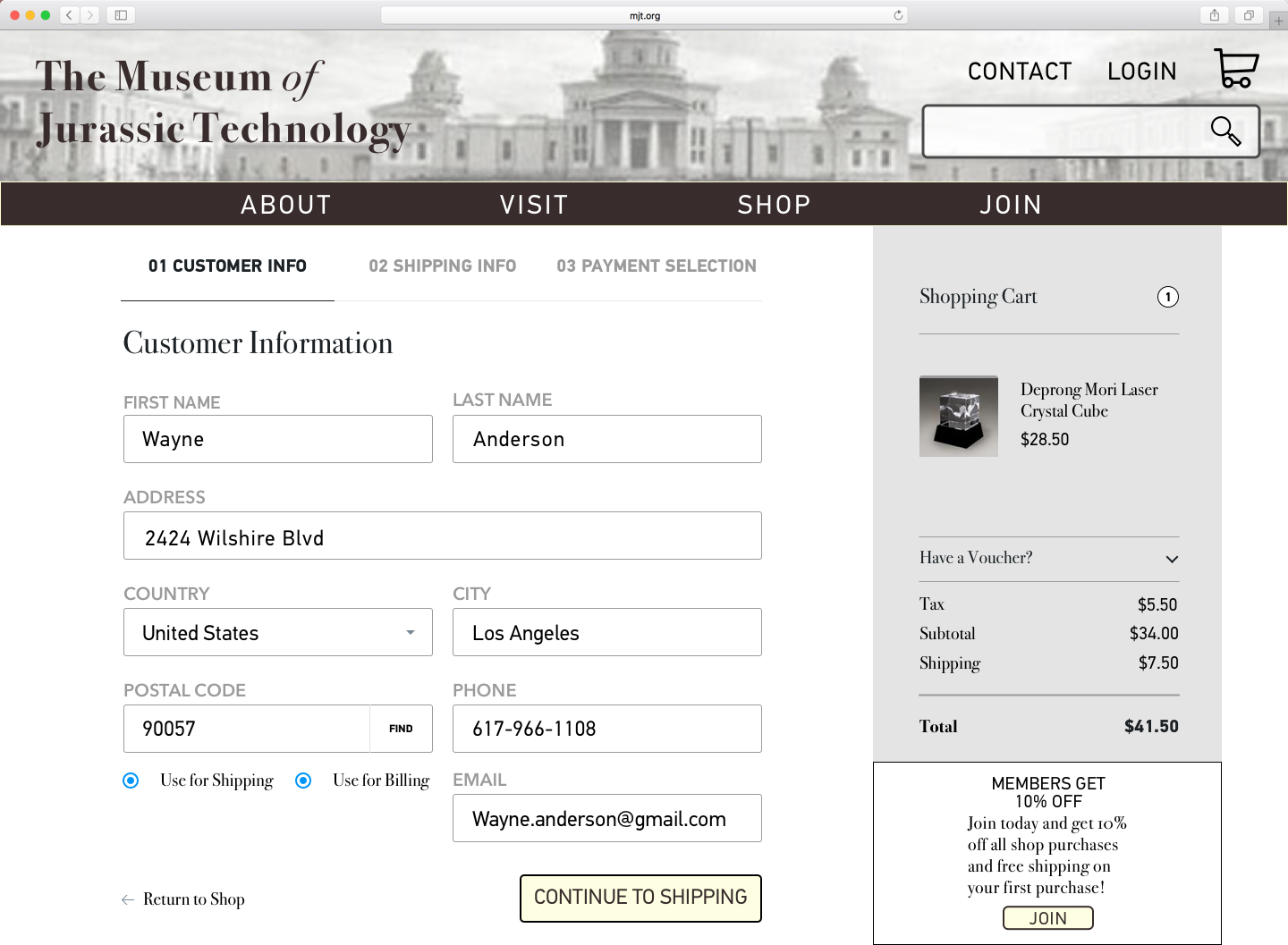
High-Fidelity Wireframes / Prototype
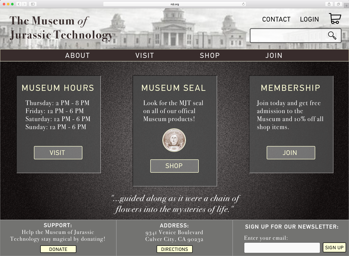
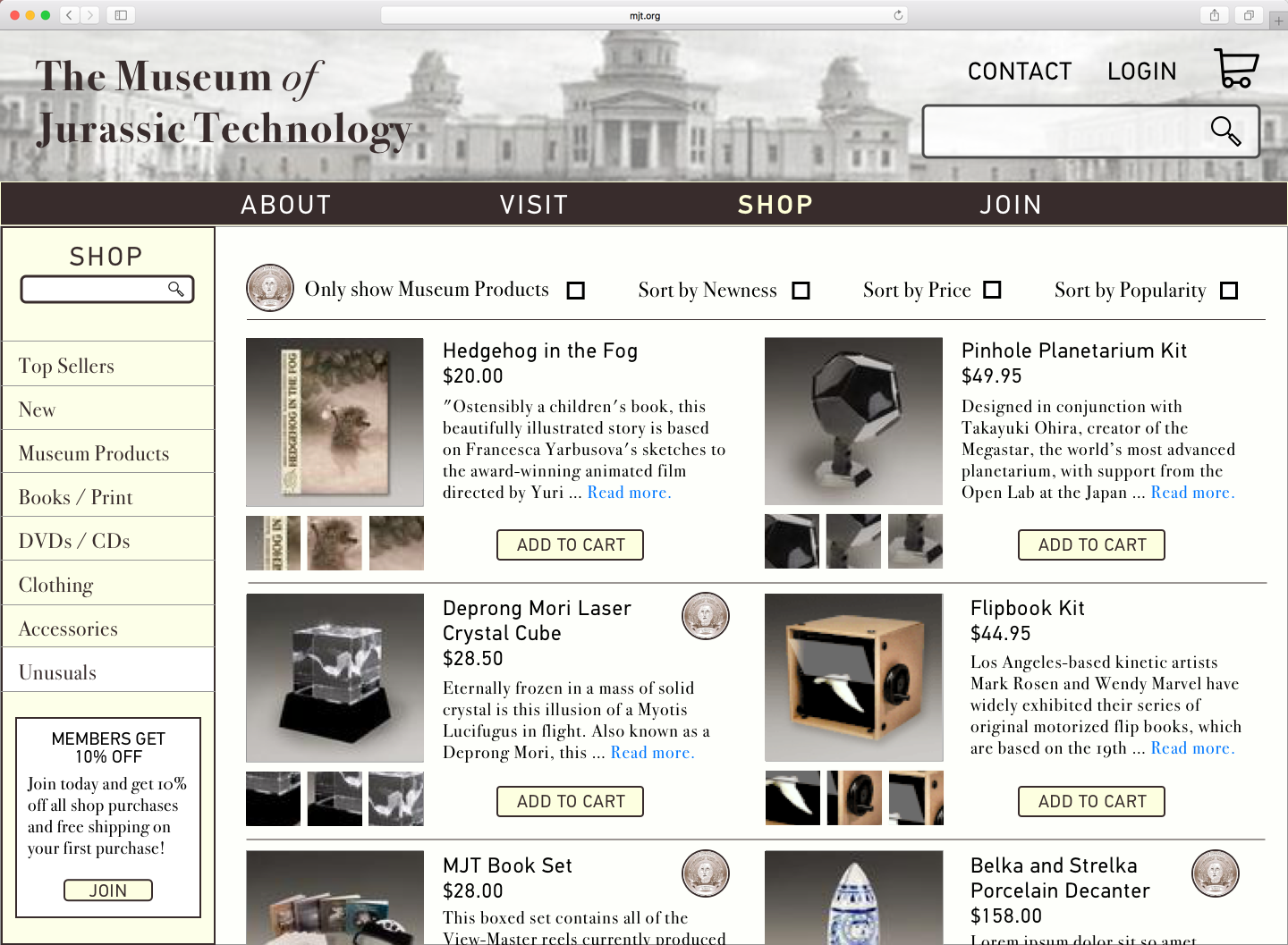
Next Steps
Implement the new high-fidelity wireframes in the Museum of Jurassic Technology website.
Get people to come back! Add in new interactive features, such as a virtual tour and/or educational activities.
Promote becoming a member! Create a free membership option which will be a way to receive user information and increase the likelihood of them joining/donating later on.